
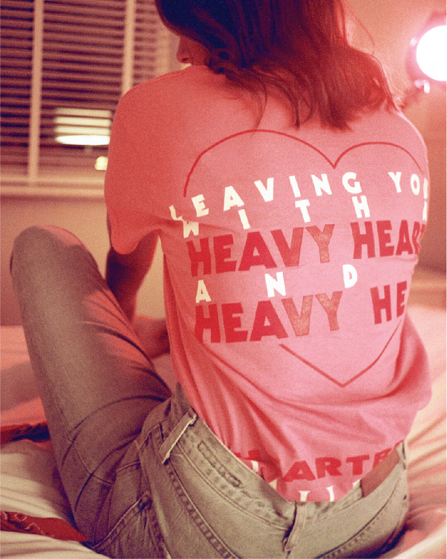

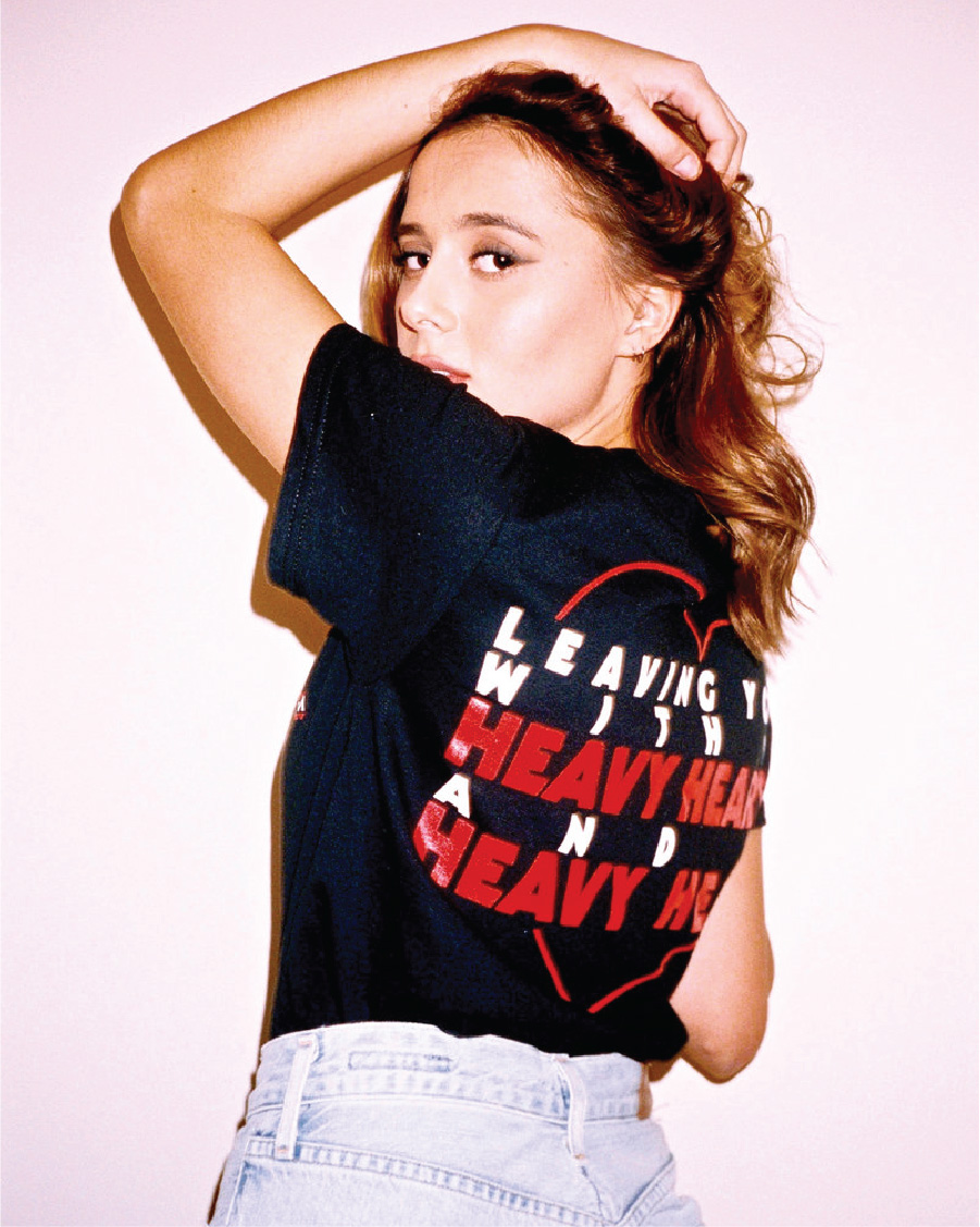


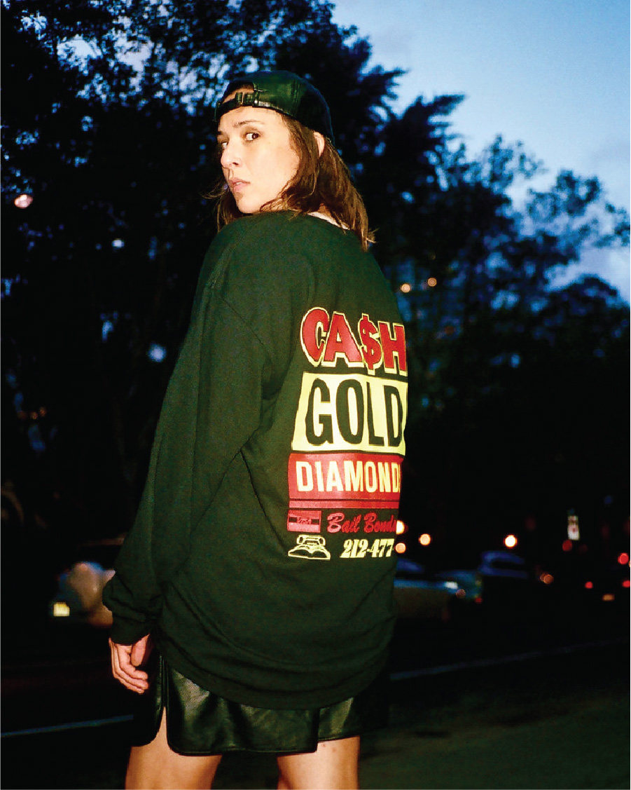
COLD TONIC LABEL — Merch
Working alongside musician Krystal Klear, I created a variety of t-shirts which represented the various inspirations behind the label (based in NYC) including the eye-catching pawn shops, call girl taglines and tacky motels that lined the streets of the city.
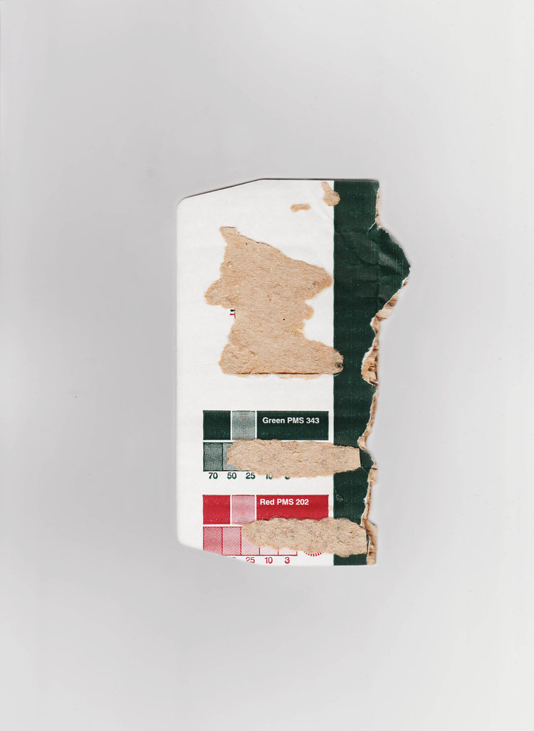

- WASTED — Mixed Media
-
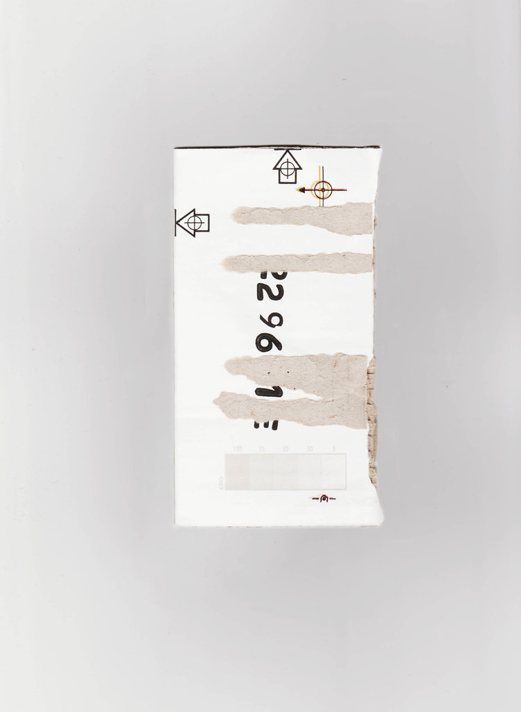
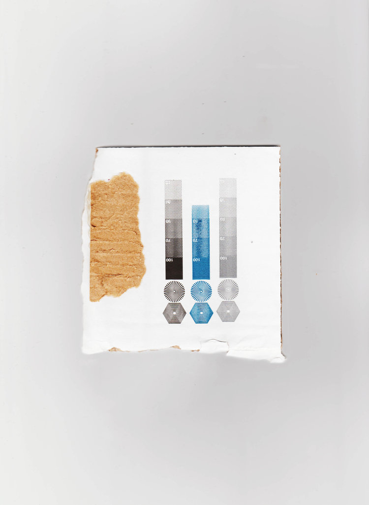
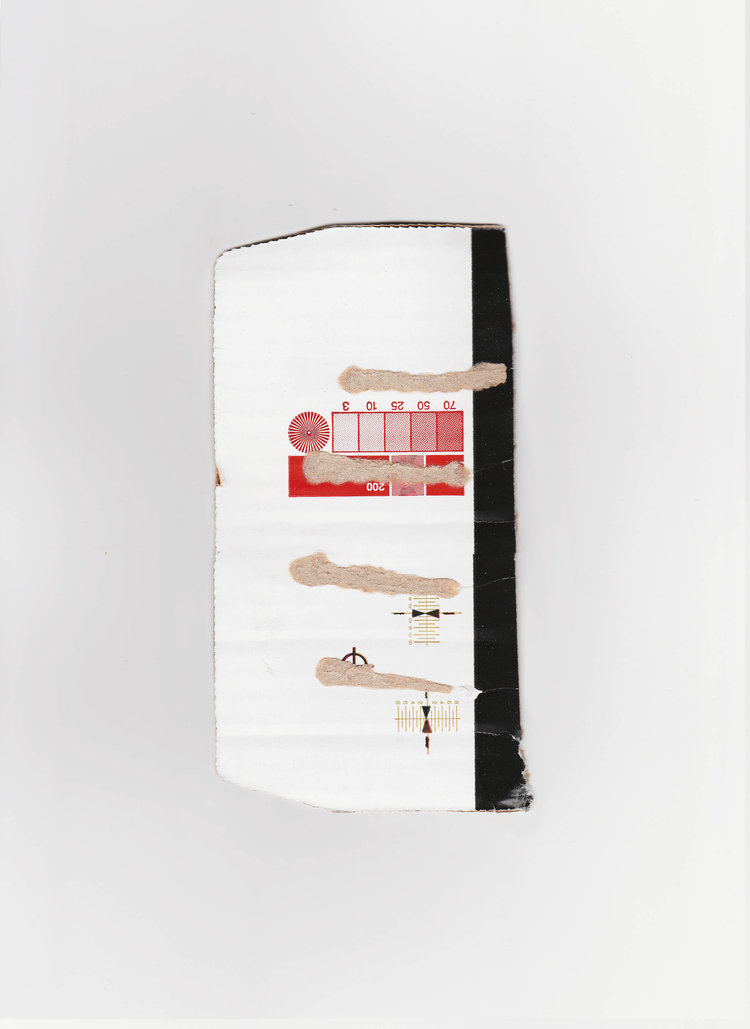
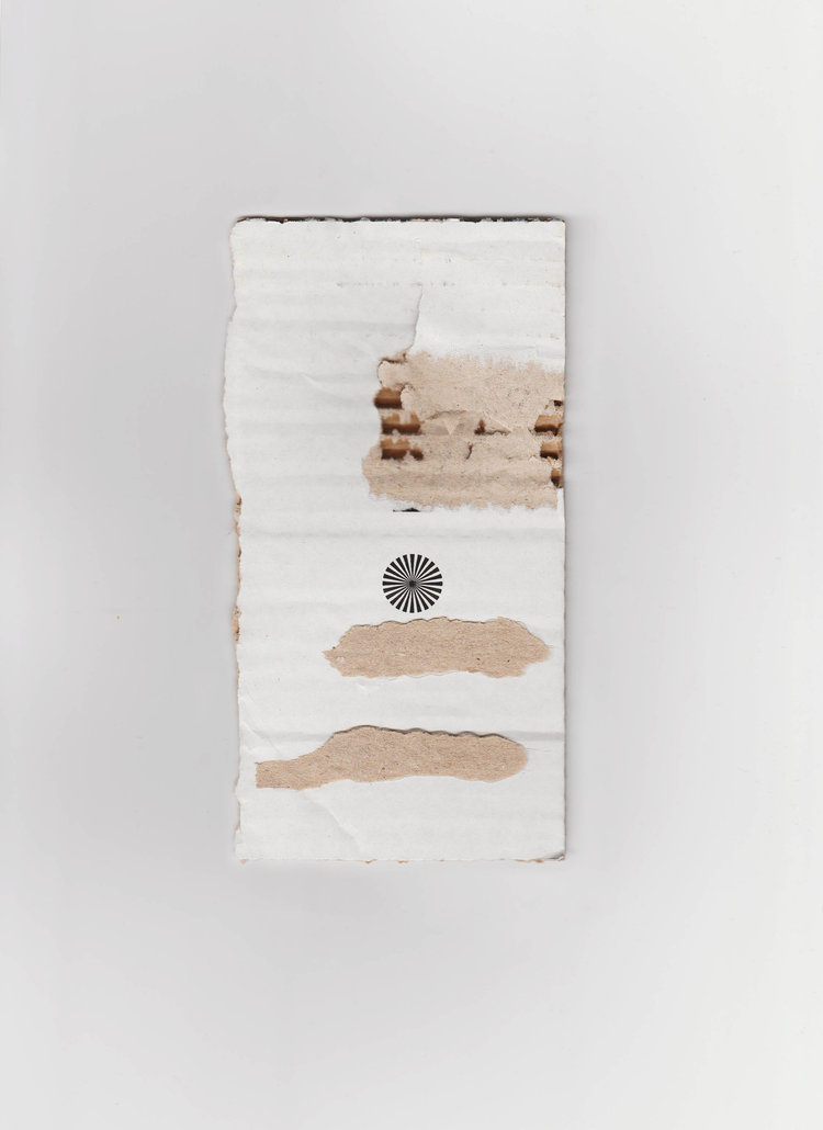
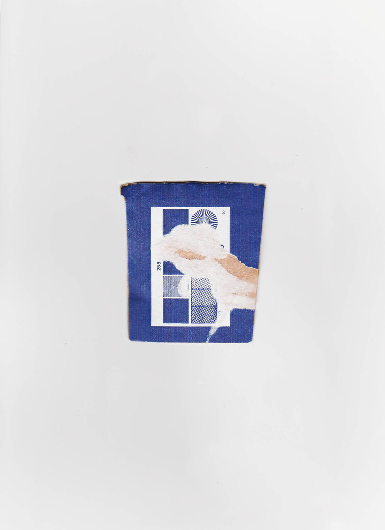
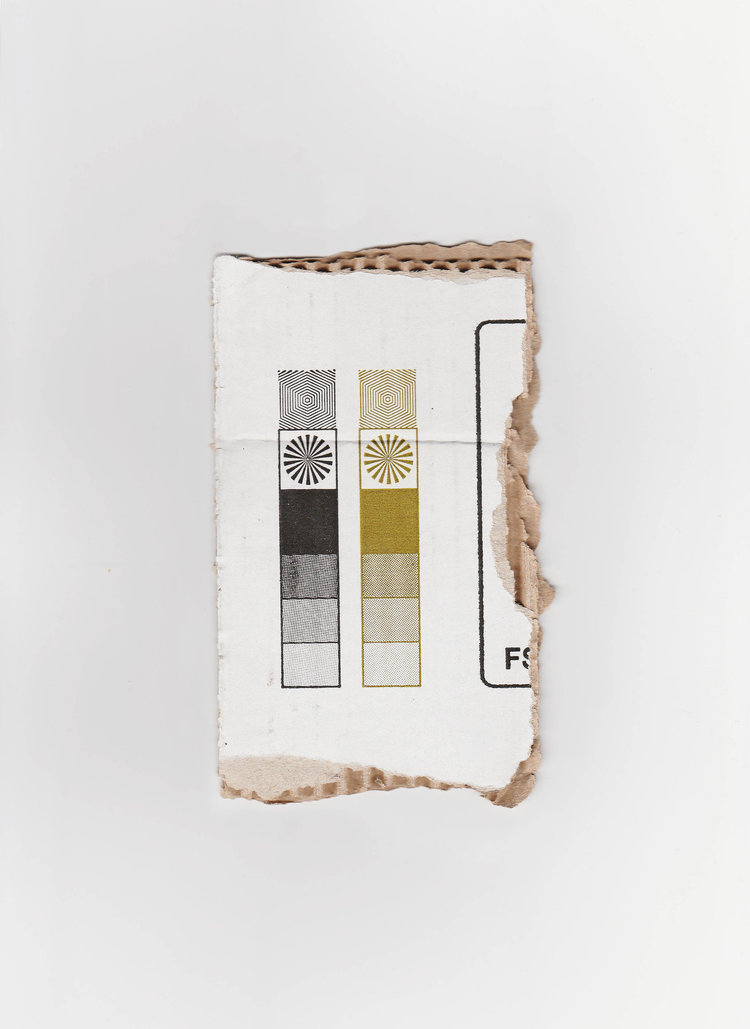
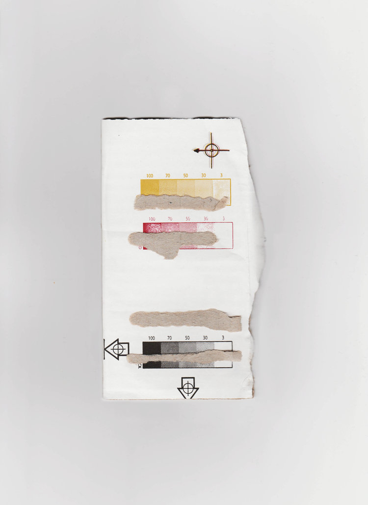
A couple of years ago I had just got out of college, had a loan to pay back and needed a job. I worked in a local off license and one of the daily jobs was breaking down the boxes and putting them in the bin. In the mundanity of this I noticed interesting symbols printed on various folds. This is a collection of them.
MARATHON
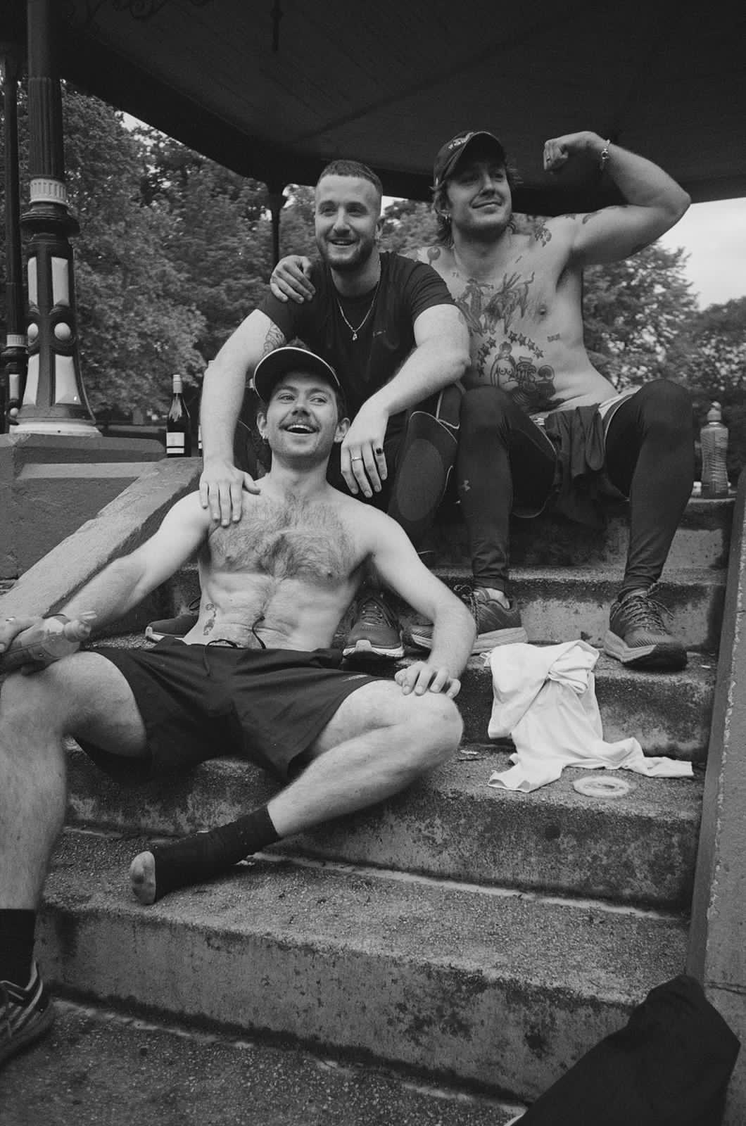
- This isn’t a piece of physical work, but it was a milestone that I’m incredibly proud to have achieved. With just over a months notice, one of my close friends informed us that he wanted to run a marathon for his birthday. FUCK. Instantly we had to put our bodies to the test with a tremendous amount of training and hard work. The weeks flew by and before I knew it, it was ten days out and the longest I had run was 18km, not even half a marathon. Throw in a late shoulder injury and I was questioning whether or not I’d even be able to run. The day came, I threw caution to the wind and laced up. What ensued was the toughest 5 hours (4hr 52mins to be exact) I’ve ever experienced. It was full of character building stuff, mental battles and telling your body to move even though everything was screaming “stop”. Happy birthday, Lorcan, you freak.
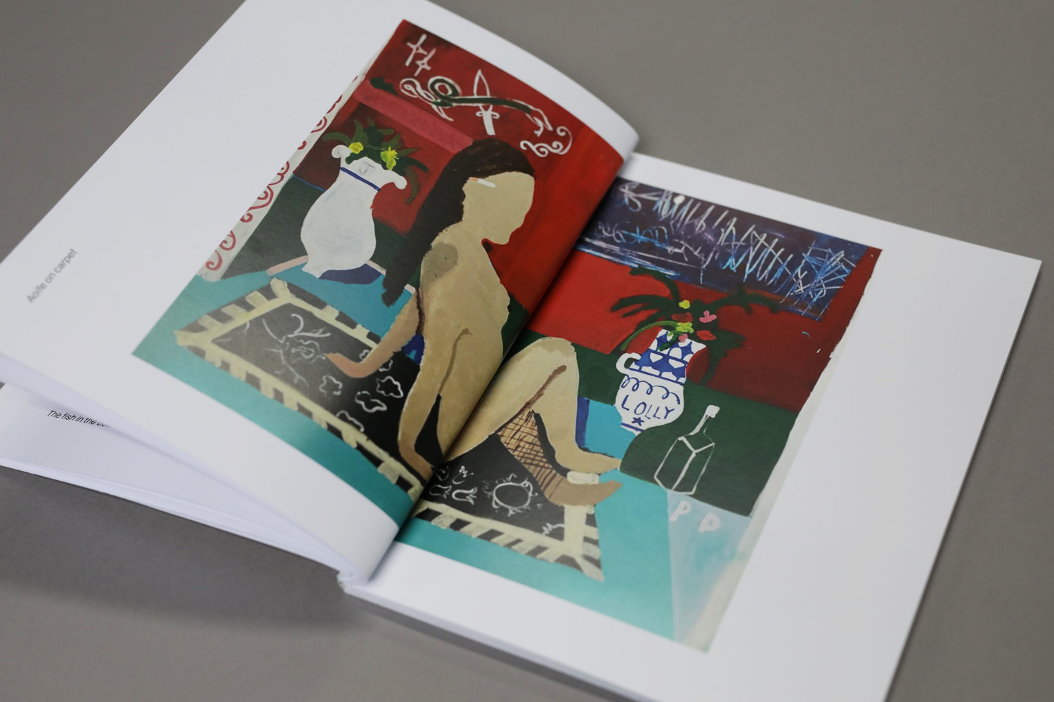
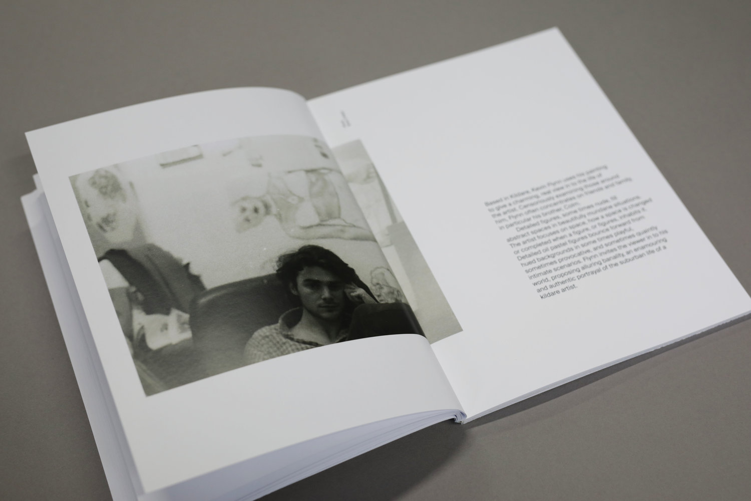

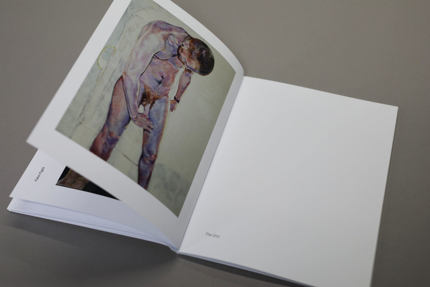
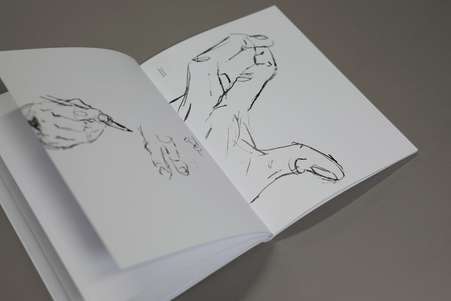
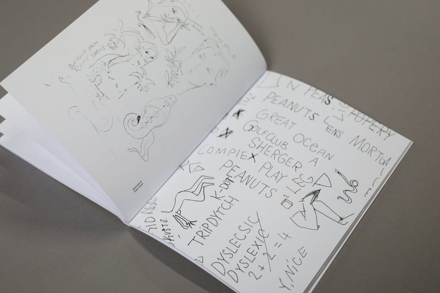
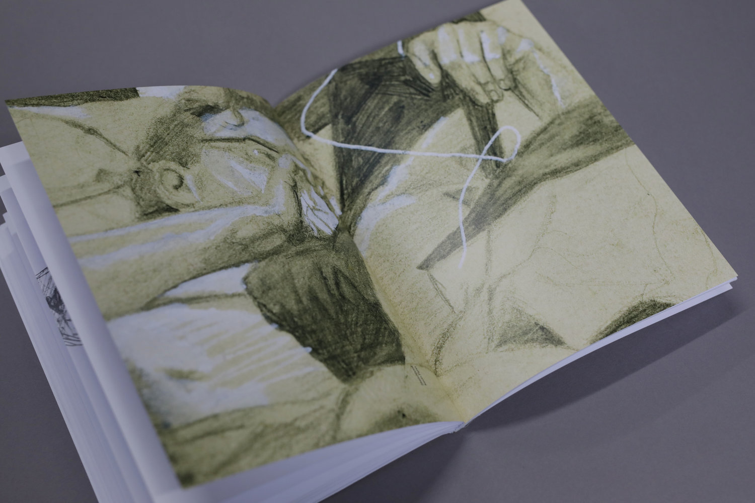
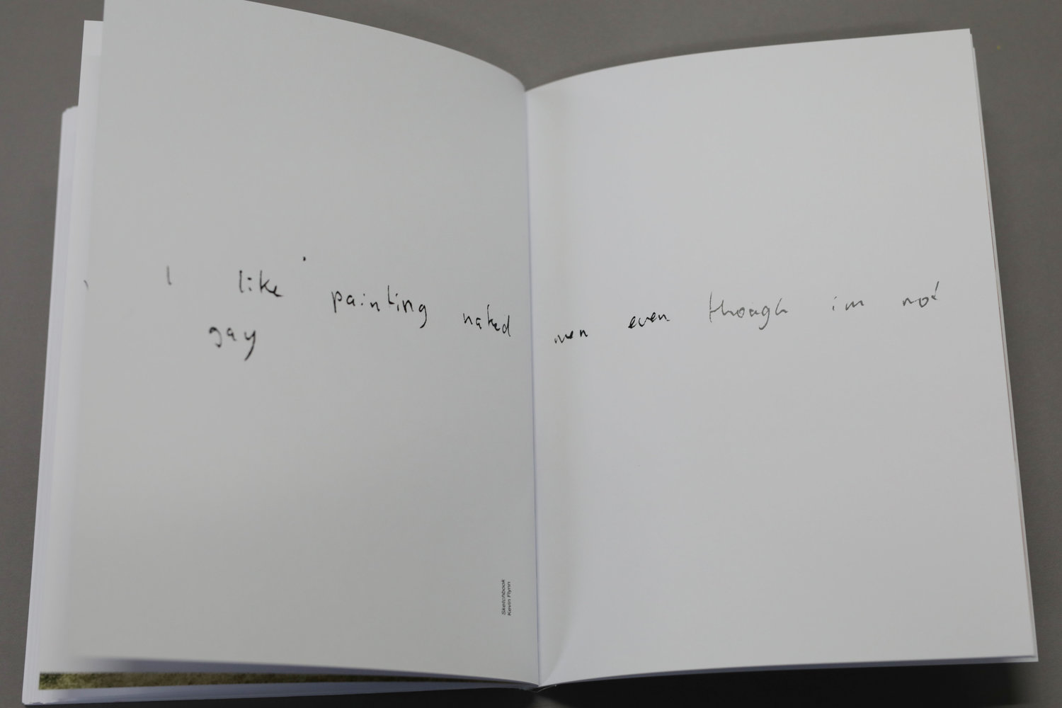
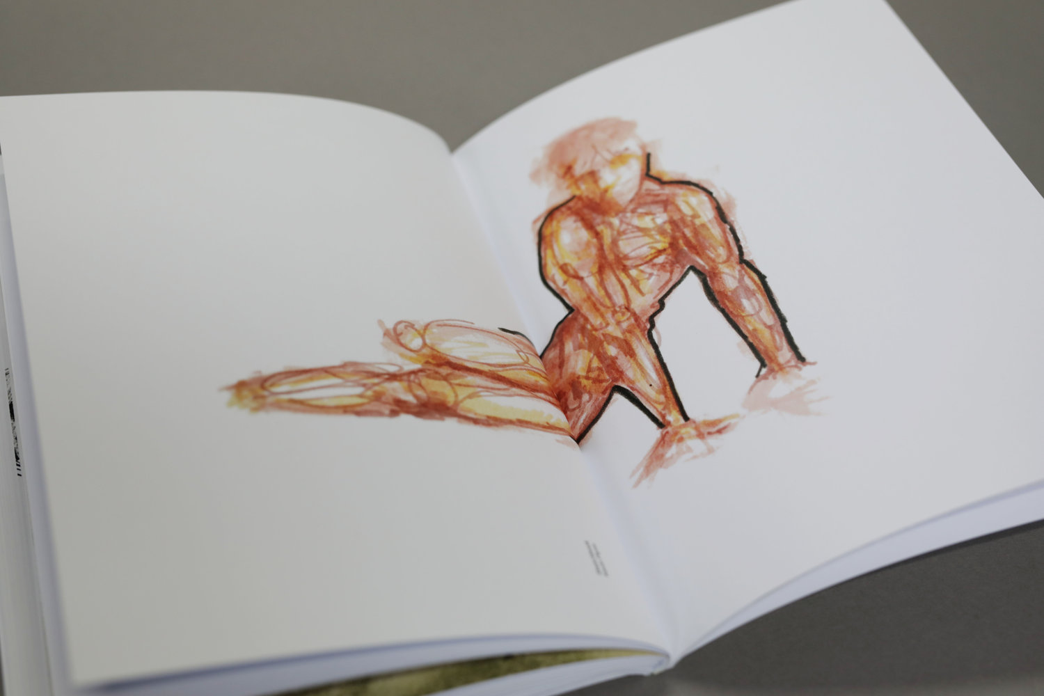
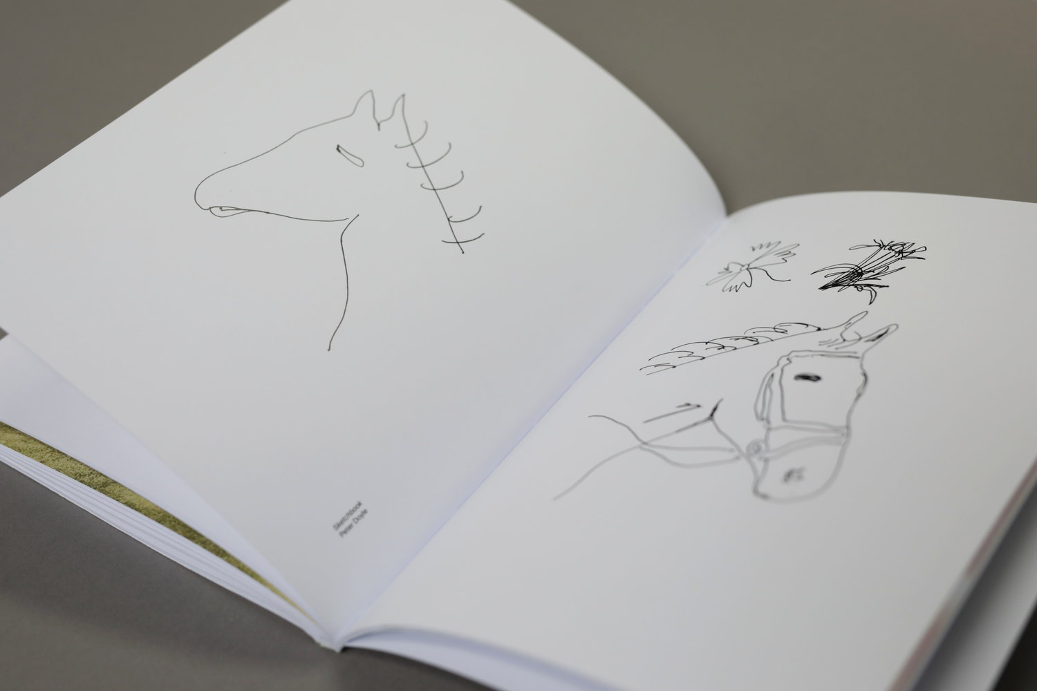

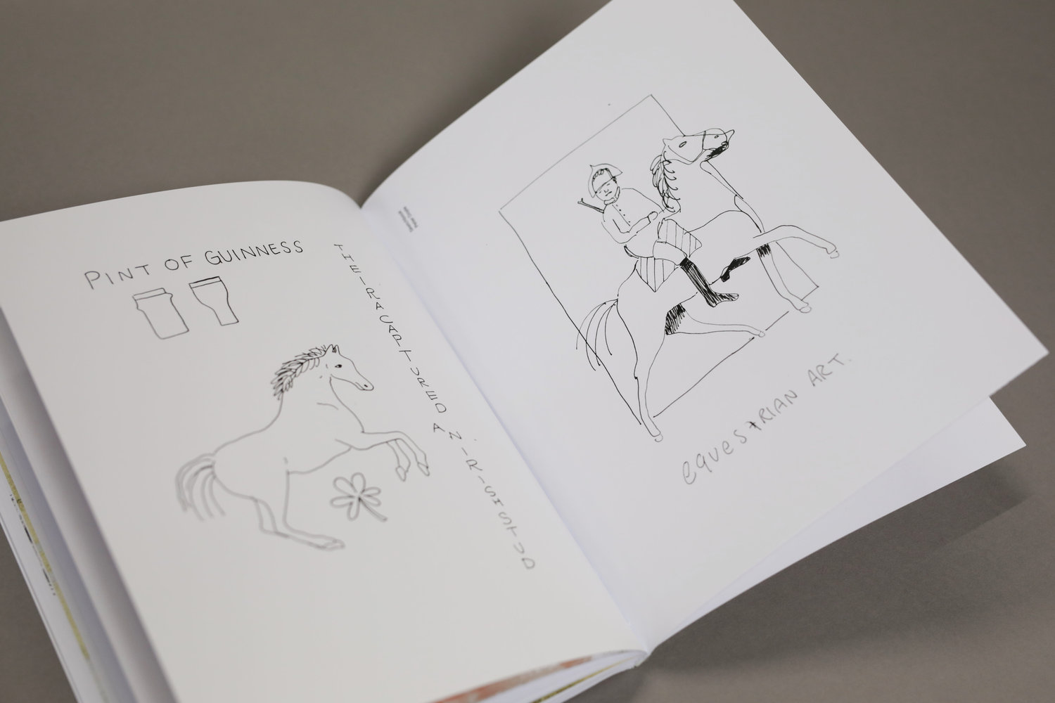
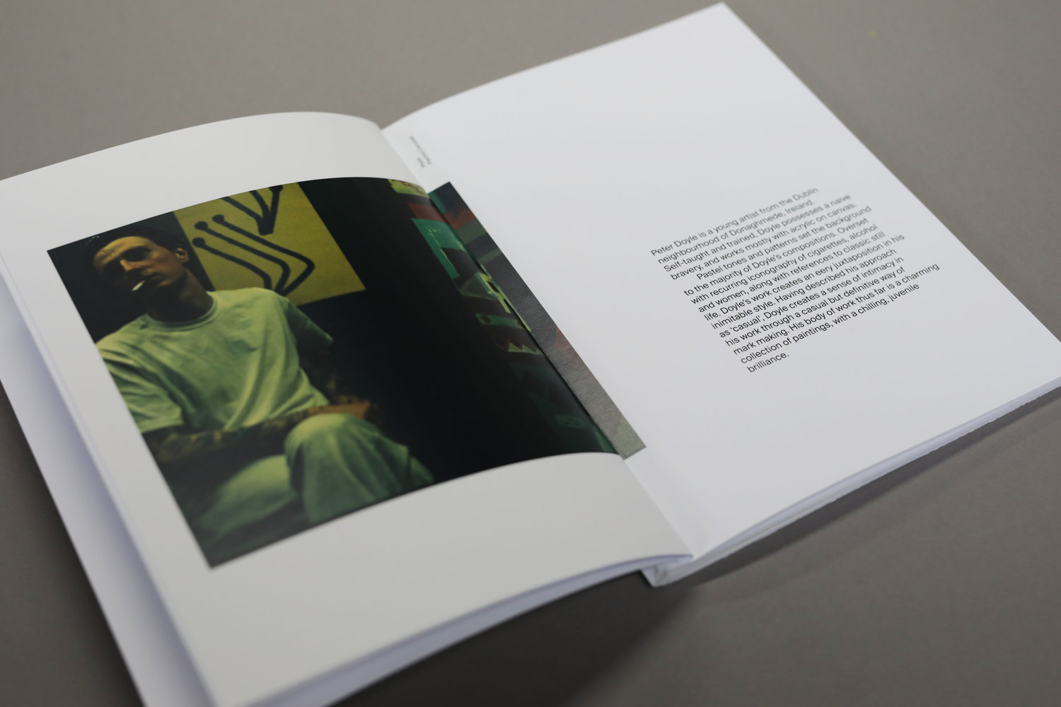
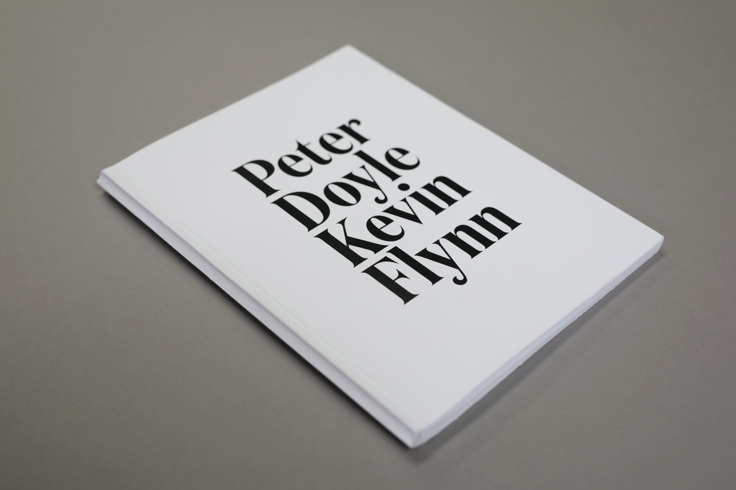

- PETER DOYLE KEVIN FLYNN — Exhibition
- I was set the task of creating the promotional material for the joint exhibition of Artists Peter Doyle and Kevin Flynn. When I was chatting to them I asked the question “how do you feel about having to promote your exhibition”, to which one of them responded “I’m a bit fucking embarassed, what makes me worthy of a poster, I’d almost rip it down” the other nodded in agreement. This was the nugget that inspired the campaign.

- SEANCHOÍCHE – Storytelling
- Part of my job is to stand up and speak, at this stage I feel like I could to it in my sleep. So when SeanchOíche (an Irish storytelling night) came to town, I didn’t think much of it - write the story, rehearse a bit, get up and tell it. When I began writing the story about a time I was kidnapped, it became apparent that it was quite personal and with that came a fear of sharing it, something I had never experienced with a creative idea. I began to feel naked at the thought of standing up infront of a crowd who could take away my story and judge me. Even though I knew the story was good, it enveloped my days and lived rent free in my mind for the weeks before. The day came and in the blink of an eye I was sat at the back of a crowded room, watching the speakers go up one by one but listening to the sound of my heart beat in my ears. I was the second last to speak and it felt like an eternity before it was my turn. When my slot came, I heard my name being called and time almost stood still as I walked towards the front of the room. As I opened my mouth and the story I was so very scared to tell, broke out of my body with it’s own confidence and commanding the room with gasps, silence and roaring laughter. And just like that it was over, the weight was lifted and the story was free. There wasn’t even relief, there was just silence again.
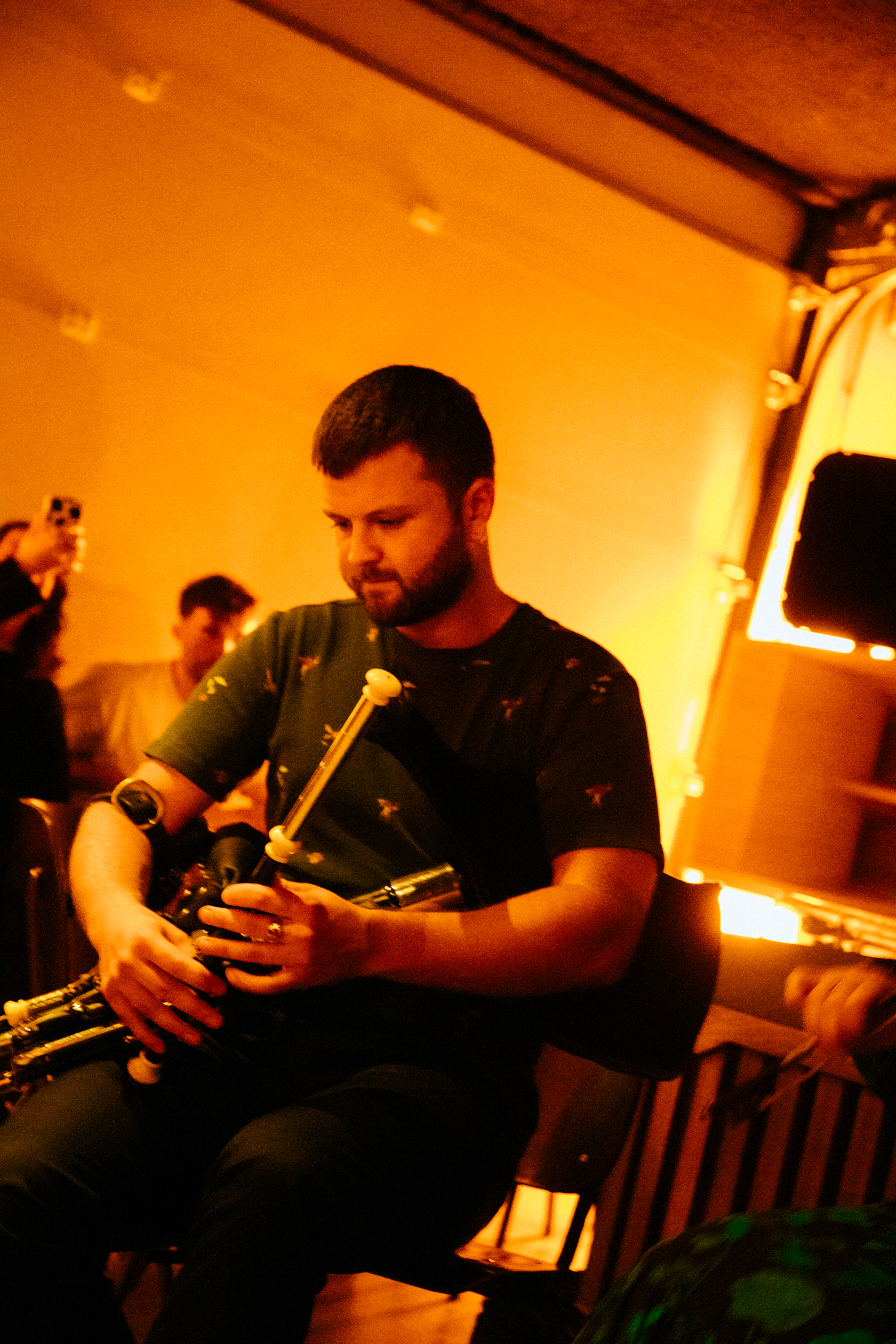
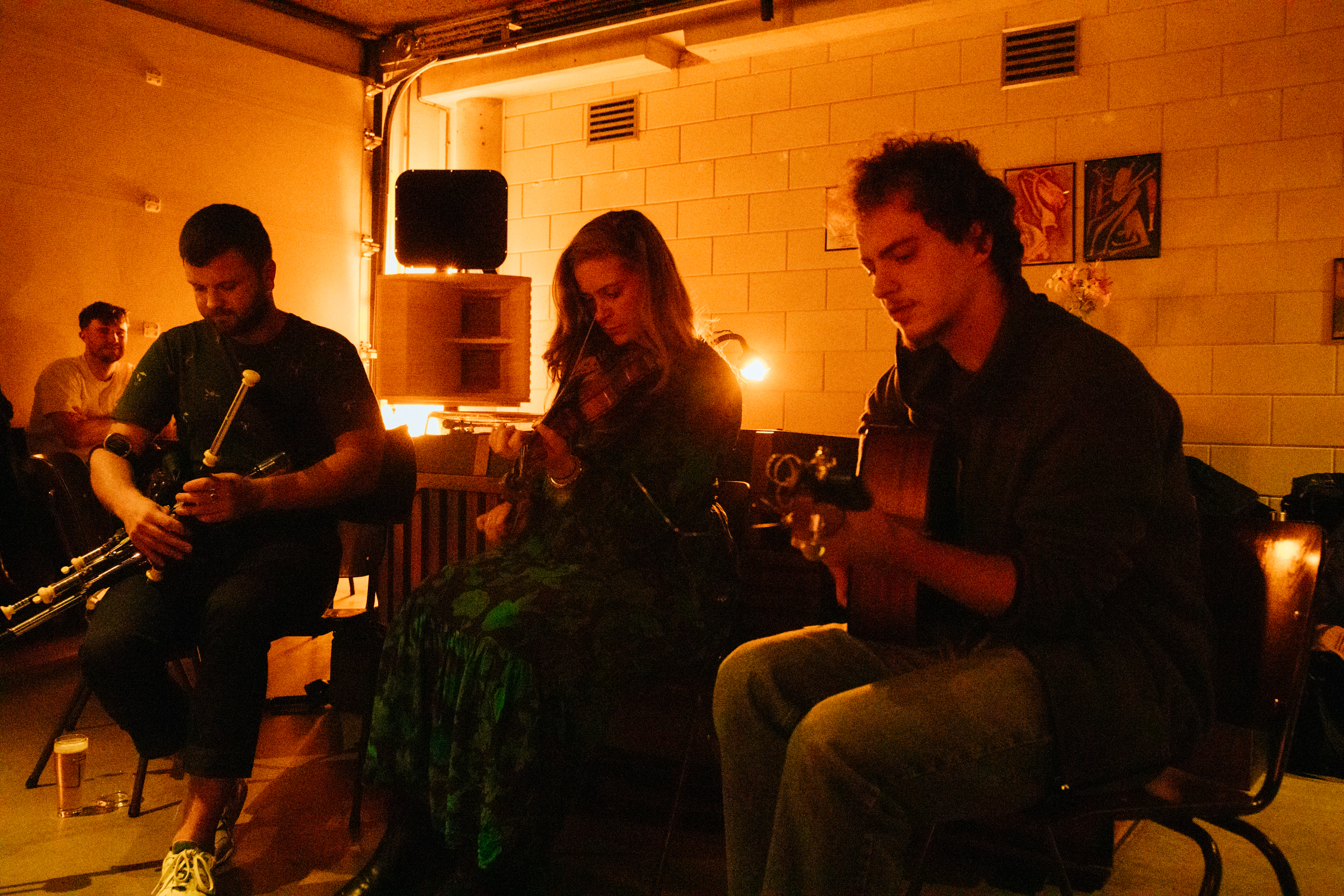
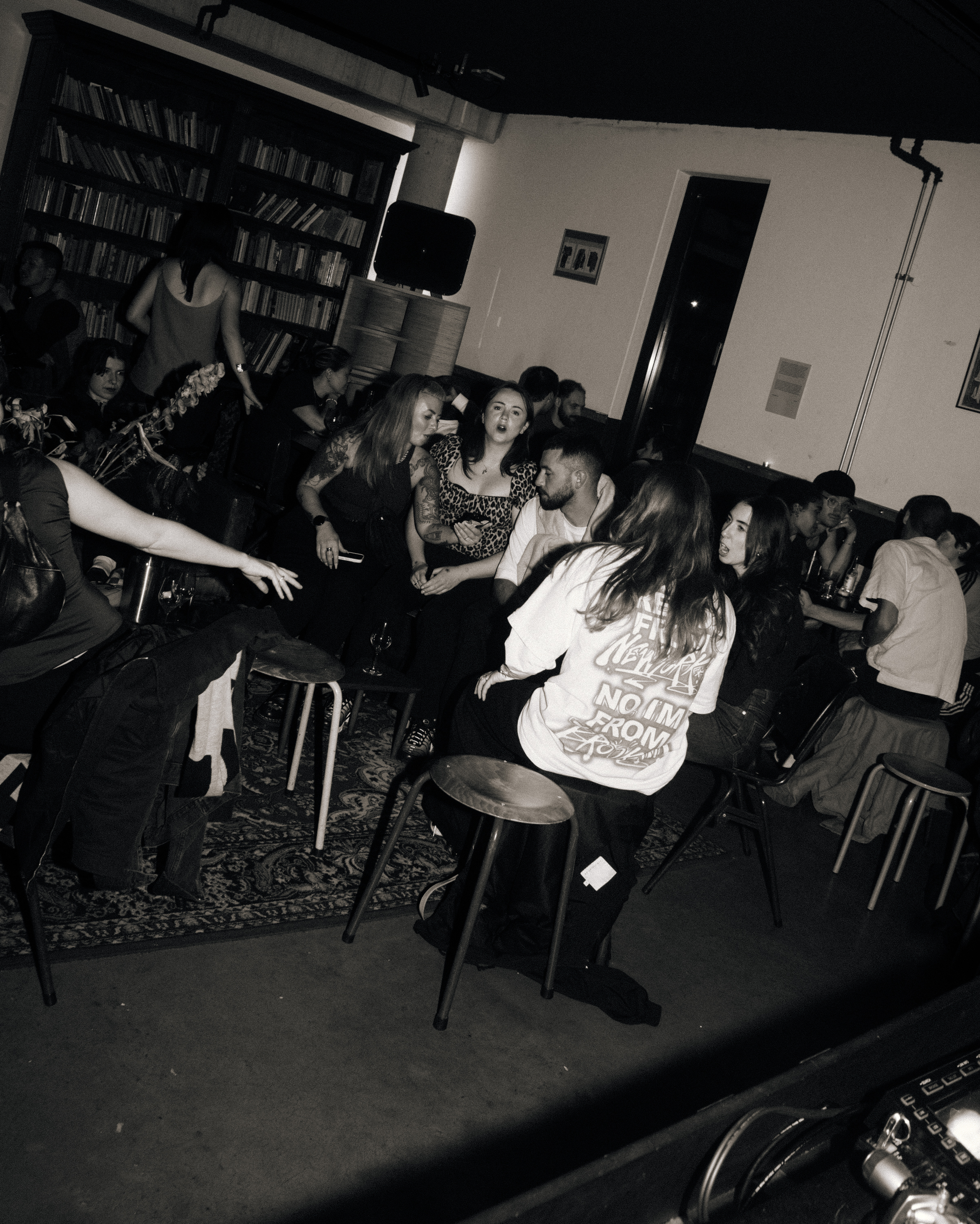
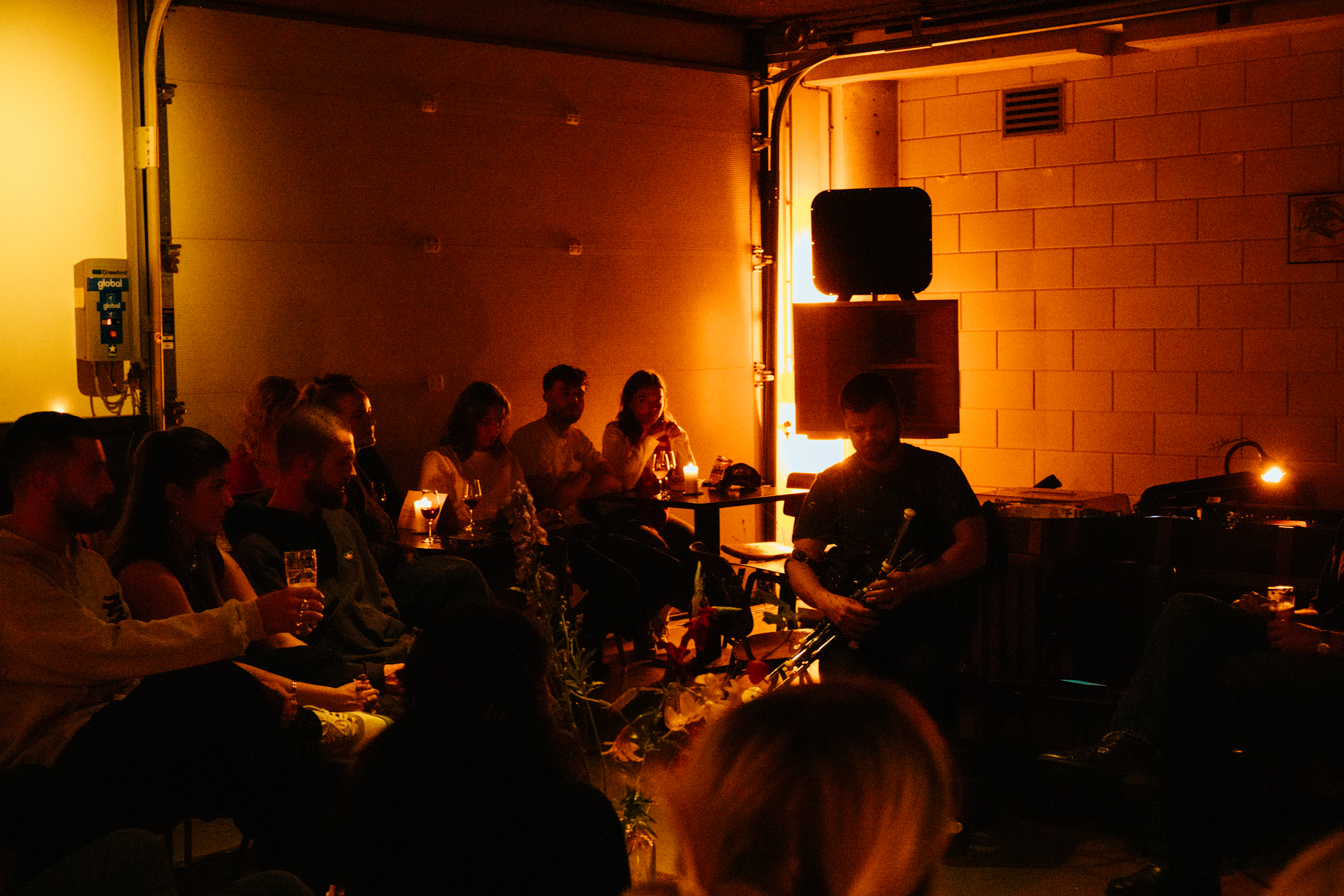
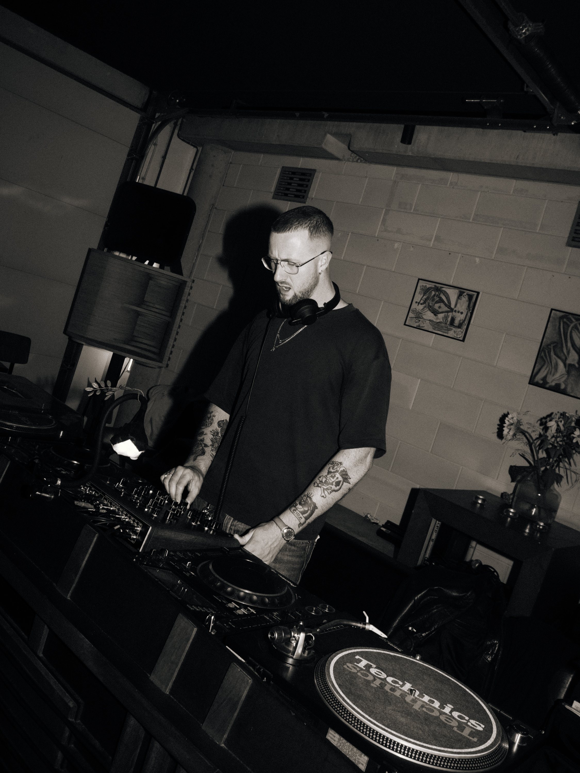
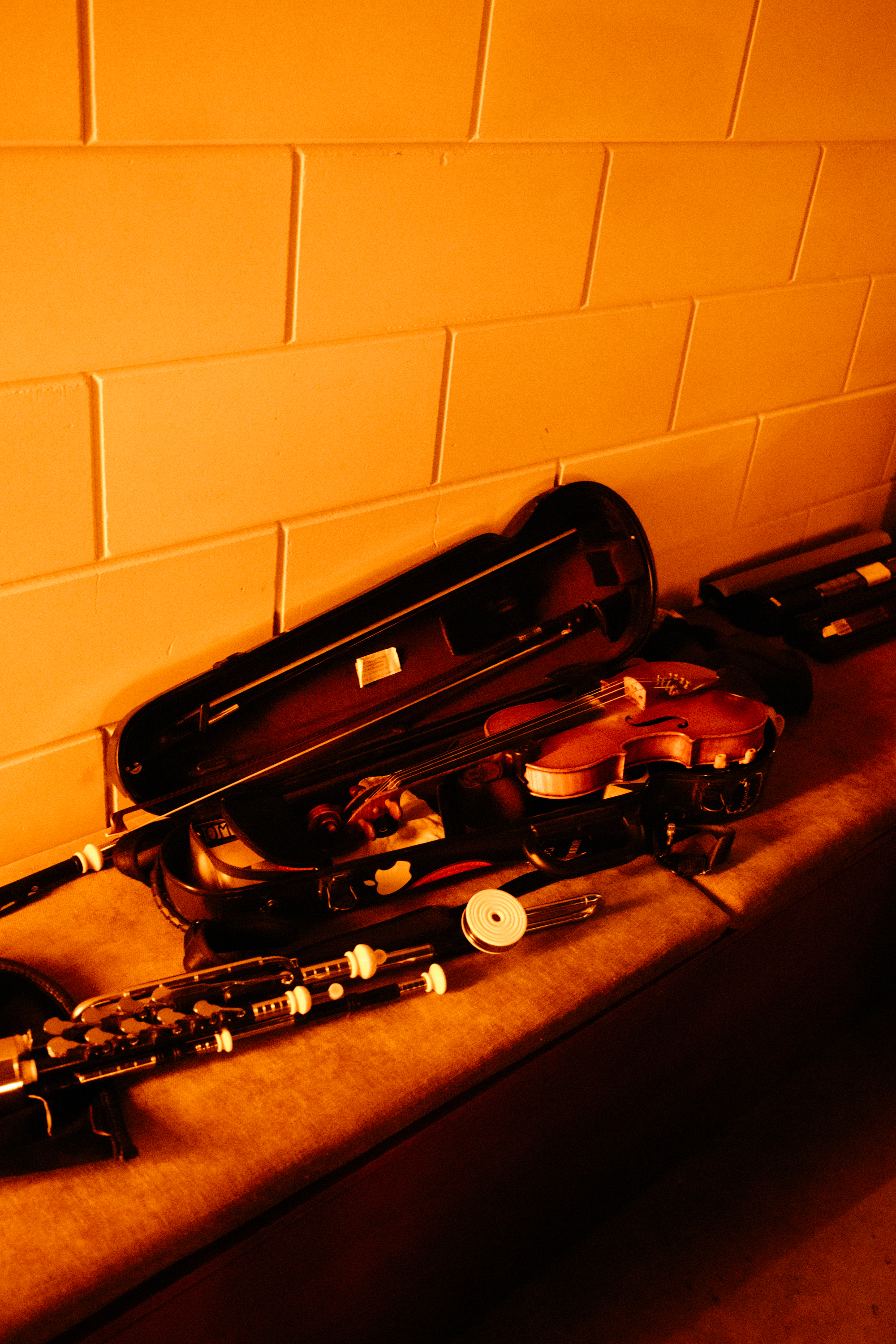
- NÓISIN — Irish ideas abroad
- They say exile is the nursery of nationality and in my case, that couldn’t be more true. I longed to move away from Ireland and when I did, I realised how much I missed so many of it’s lovely cultural elements. I began learning more about my history, deeply researching and reading. It even led me taking Tin Whistle lessons, an Irish instrument I had been forced to learn years before. I had been force-feeding myself all of this Irishness with nowhere to express it. Until I met with a friend, Mark, who was dj-ing Irish music in a bar once a month under the name Nóisin and he asked me to join him. We started talking about how much more than dj-ing the night could be and that was the beginning of Nóisin’s new era – a place for Irish ideas to live abroad. It started with an intimate introduction into the Uilleann Pipes with musician Fiachra Meek. Follow us instagram.com/noisincollective/ to see where the journey takes us.

- DAVID BOWIE FESTIVAL — Image and Sound
- To celebrate the second year of Dublin Bowie Festival, Image Now Gallery hosted a typographic poster exhibition that explores the work of David Bowie. The show featured 25 posters, created by 25 creatives from Dublin and London – one for every studio album released by the icon during his five-decade-long career. I was given the “Rise and Fall of Ziggy Stardust and the Spiders from Mars.” and working with found photography I created this poster.

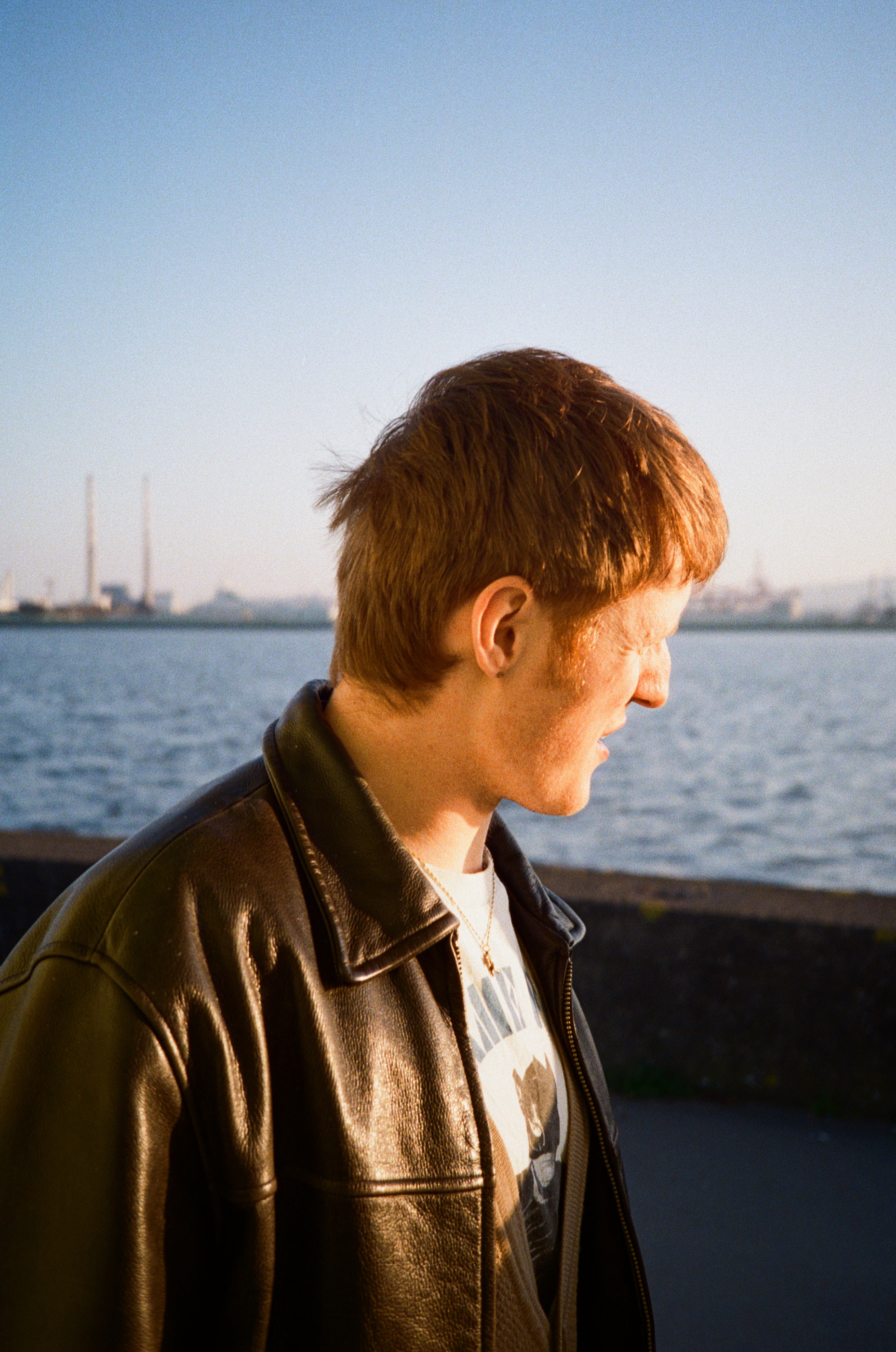
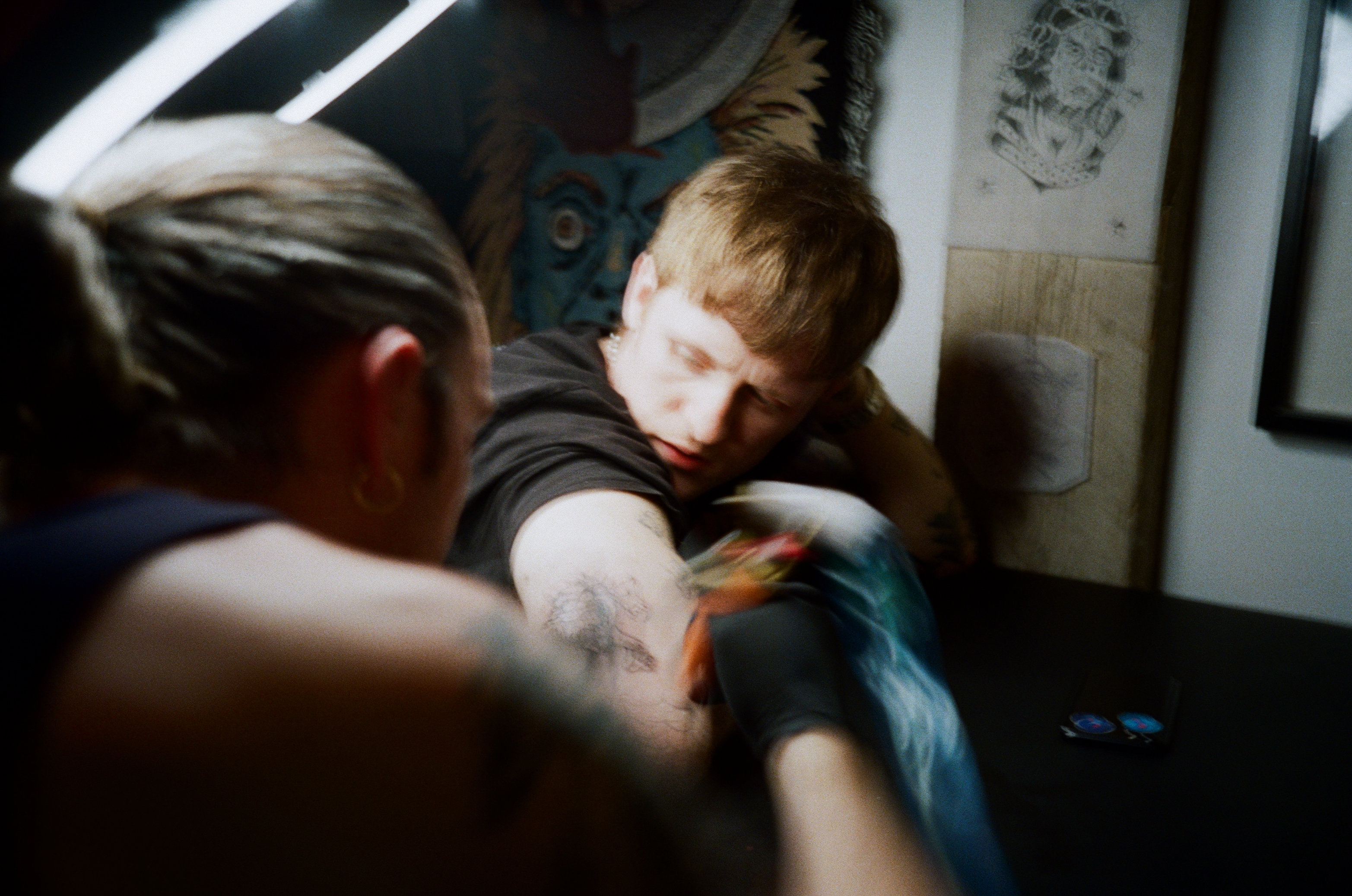
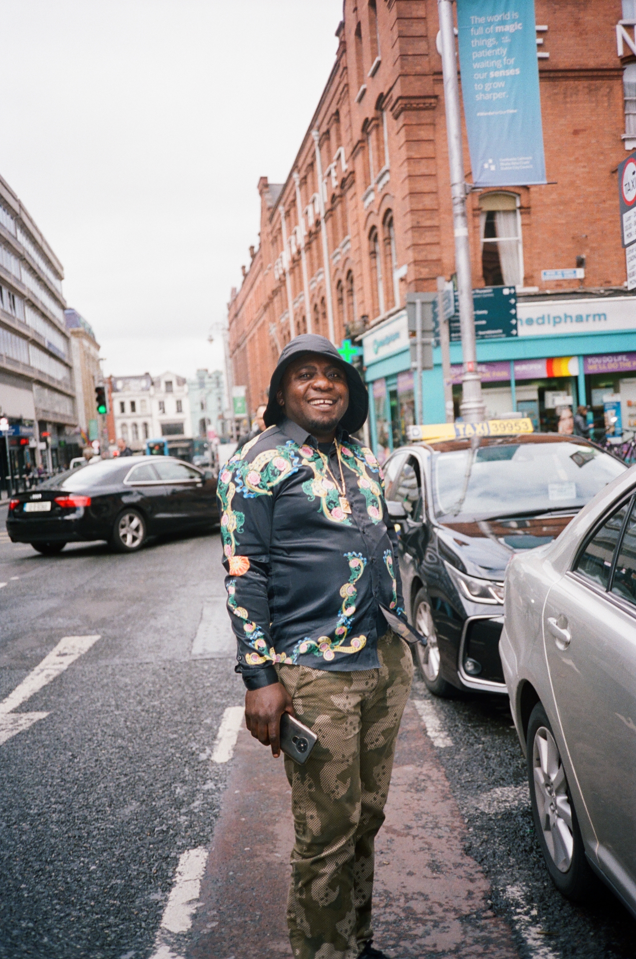


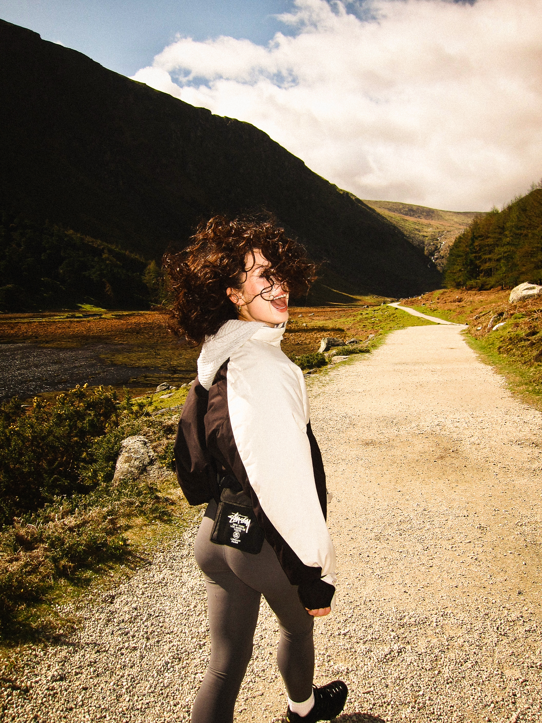
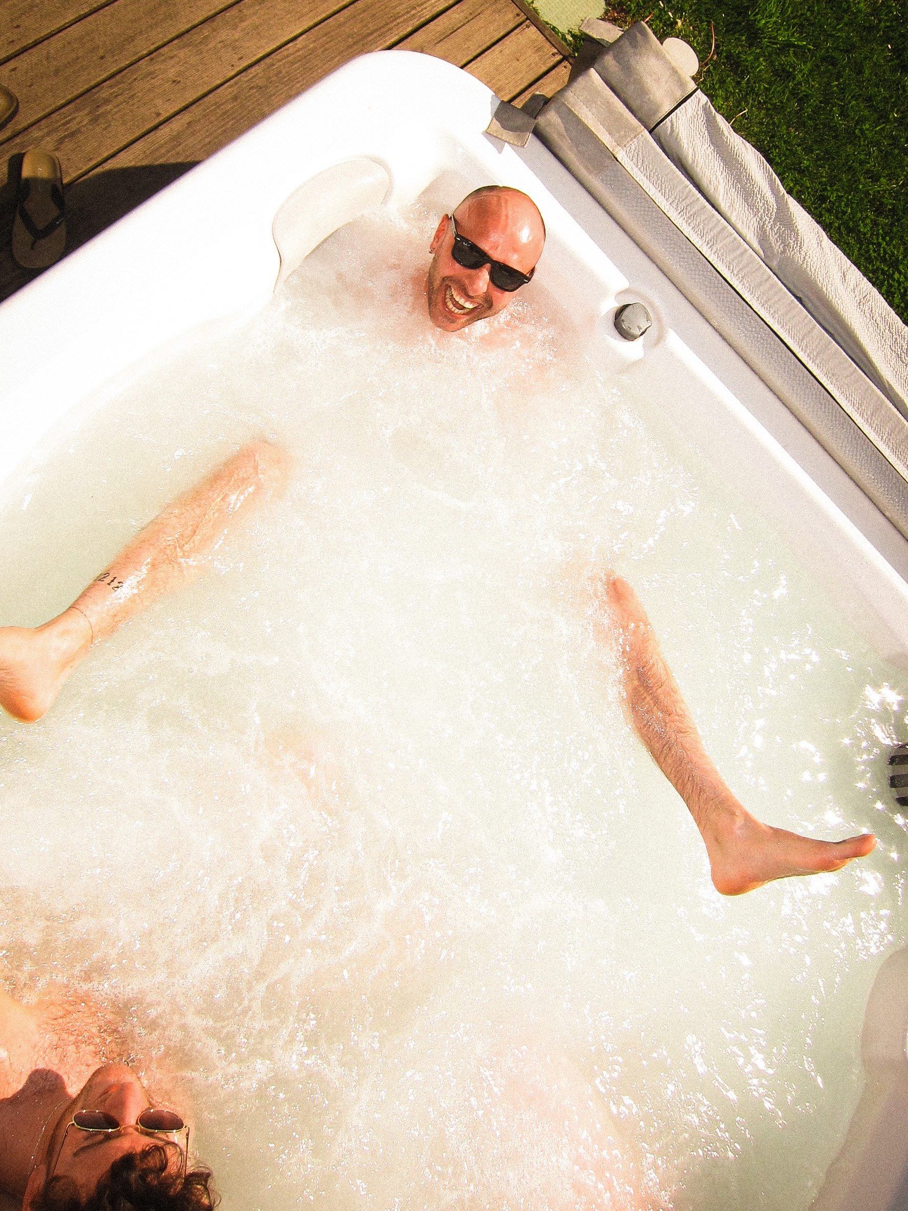

- PHOTOGRAPHY
- In my spare time I try to snap people/things/places that interest me. Here’s a collection of those images.
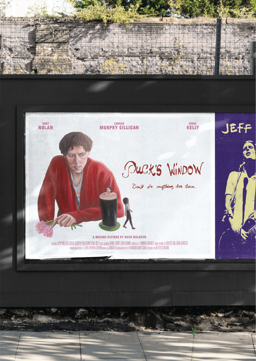
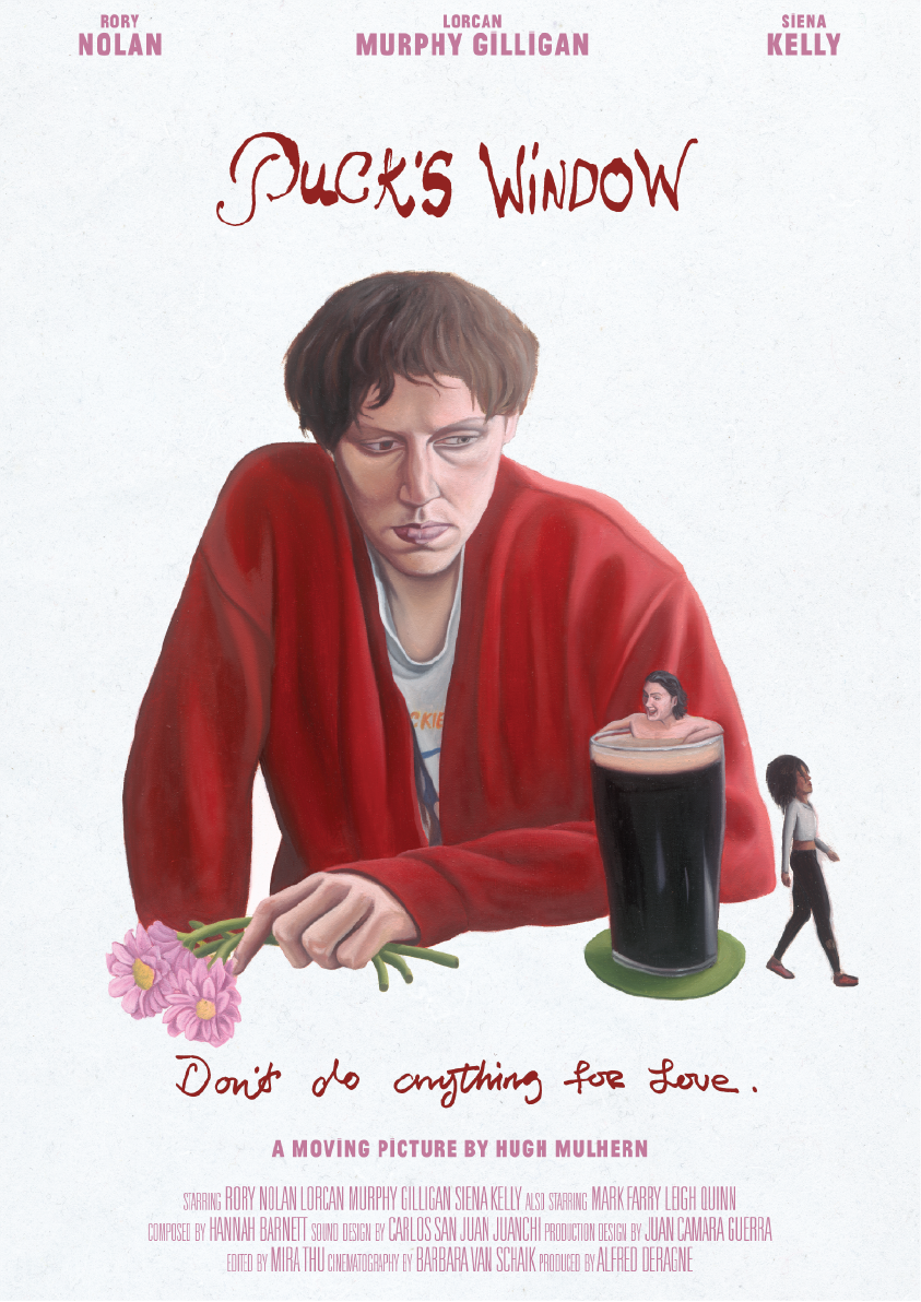
- PUCK’S WINDOW — HUGH MULHERN
- Working alongside painter, Kevin Judge, we created the poster for, Hugh Mulhern’s short film “Puck’s Window”. It depicts, Puck, the main character, in a heartbroken state, staring into his pint of Guinness which holds his best friend and loveable messer, Salv. Just out of his eyeshot is his ex-girlfriend Cliona, walking away, representing the heartbreak.
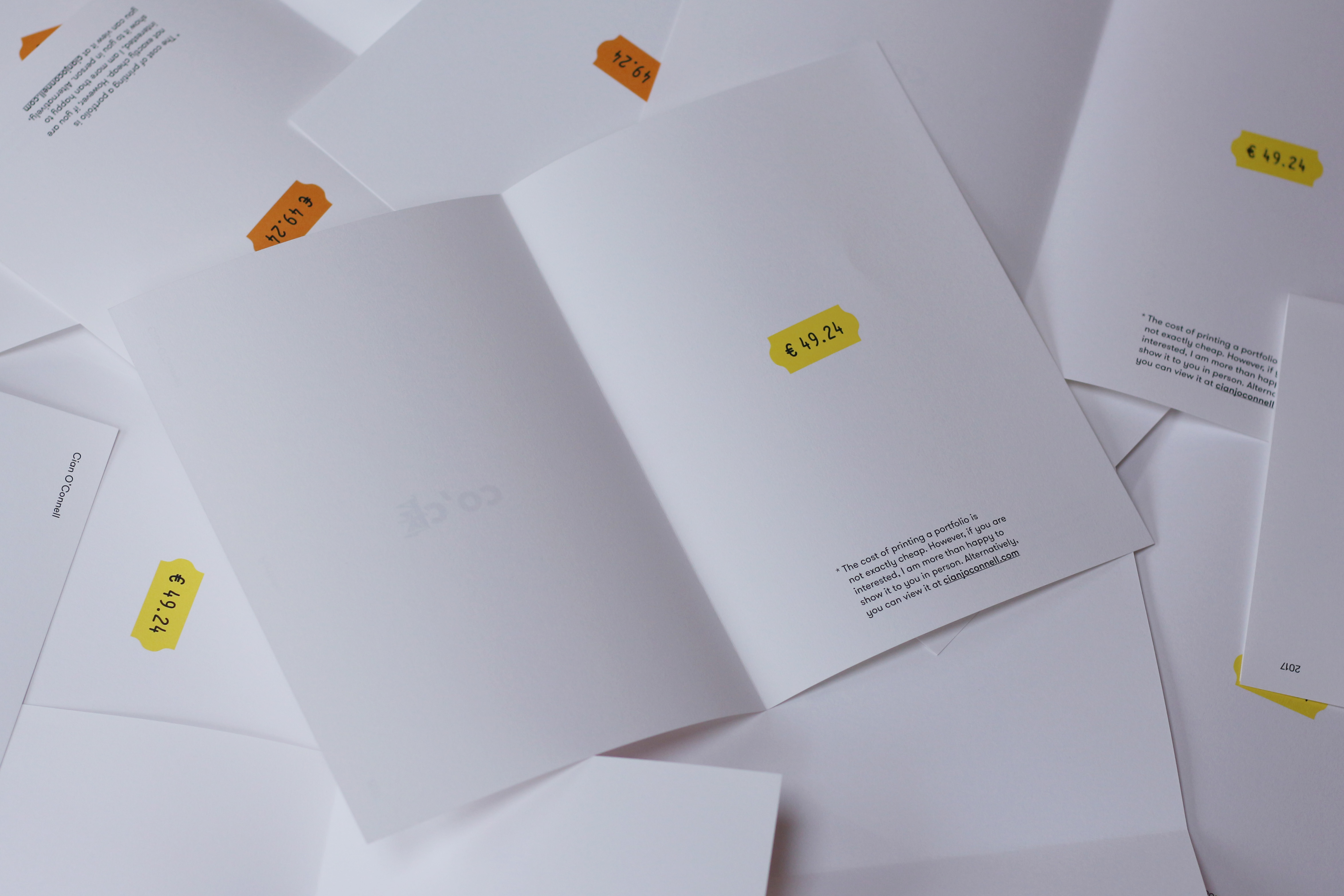
- SELF PROMOTION – What’s the price?
-
Being fresh out of college, I couldn’t afford very much and I needed
a job in an agency. Competition was stiff and I had to stand out. I worked out that it would cost me €49.24 to print and send around a portfolio but I could only afford a fraction of that. So I took that fraction and created these “portfolios”.
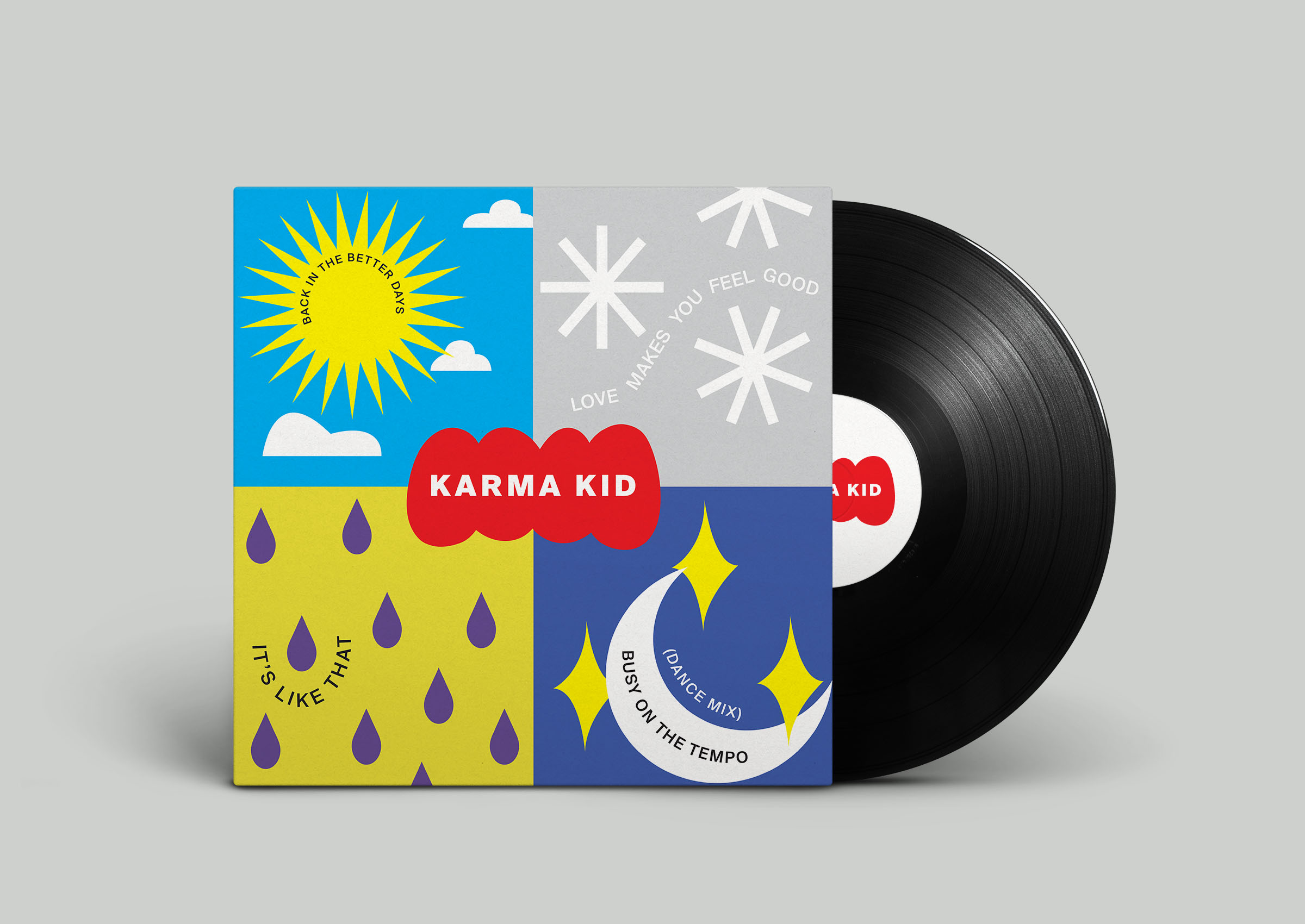
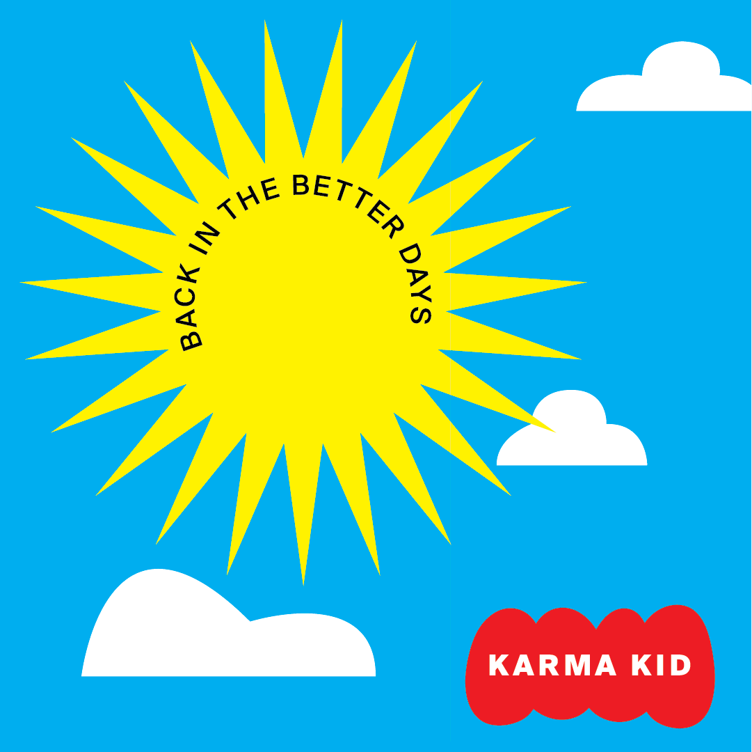
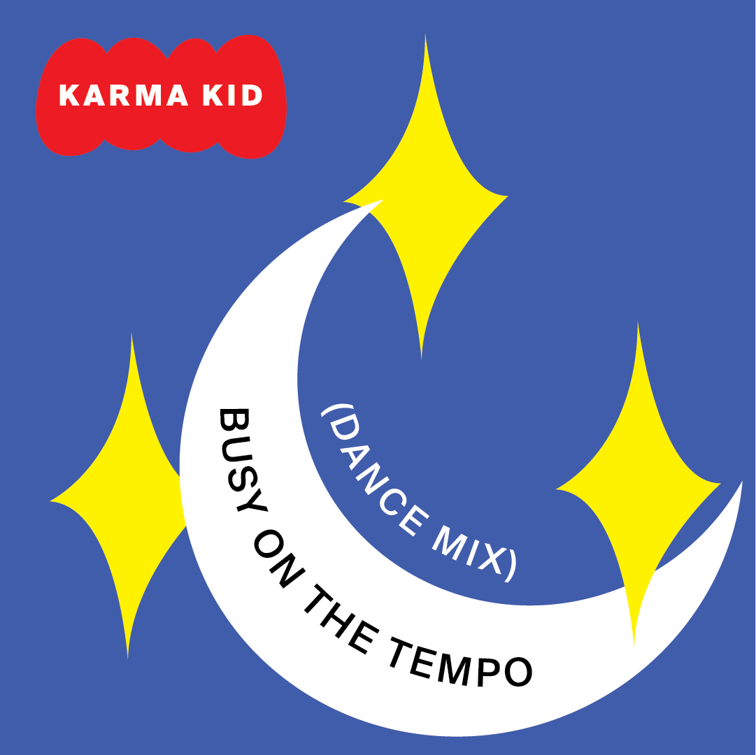
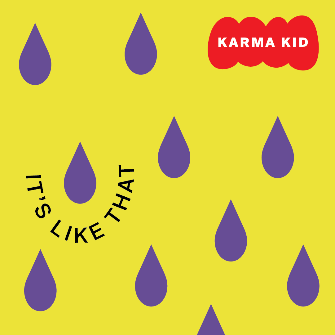
KARMA KID – EP
- When listening to the tracks, I recognised they showed great dexterity and each had a different feeling to each of them. Some felt dark and ravey, others light and breezy. It felt right to explore a direction that each song had it’s own tile within the 1080x1080 square.
I decided to represent each of them by a season - and within the seasons there are the different icons and shapes which are associated with them. It represents the versatility of the EP.
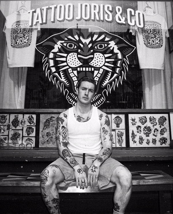
- LEGS DIAMOND TATTOO – Promotional Material
- Upon arrving in Amsterdam, Legs Diamond Tattooer, needed to make a splash with his business cards. We came up a bunch of quips to catch the attention of new clients on Dutch soil.
- MOVIES – Letterboxd
- Cinema is truly one of my greatest passions and it has been quoted that I “watch movies for sport”. With that being said, I love to see what people are watching and I’ve found Letterboxd to be a reliable place to keep up to date, so if you’re a member, drop me a follow!